In-Store Signage, Wayfinding and VM Design
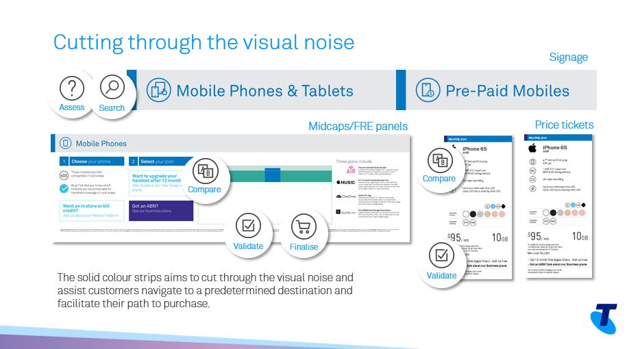
Research and observation showed that there was a lack of clear and consistent navigational signage to help direct customers where to go when entering and moving around a Telstra store. Additionally, the large volume of information being presented can be overwhelming to customers. Instead of reading, customers often chose to ignore the signs and instead ask for assistance.
The objective was “how can we develop a system that allows a hierarchy for clear signage, wayfinding and visual merchandising, so that customers can easily navigate around our stores and extract key messages and information?”
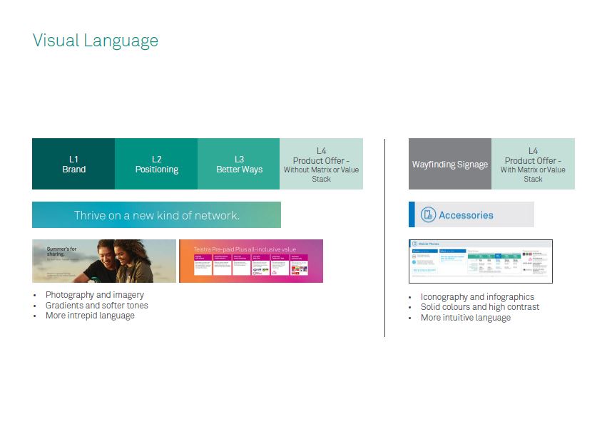
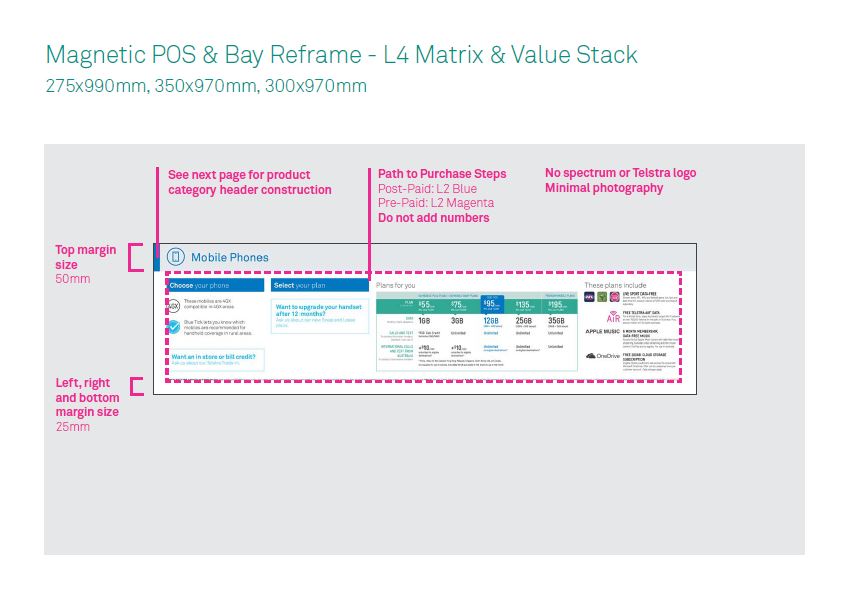
A set of design guidelines were developed and implemented. Through this framework, the following was achieved:
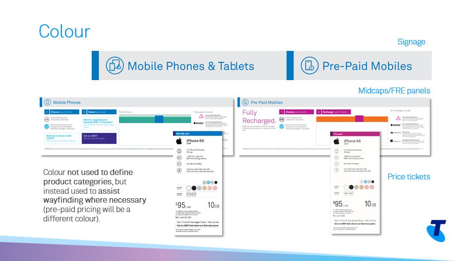
- Optimised wayfinding and “path-to-purchase” experience
- Alignment in design language used in-store, on digital and in catalogues
- Established message hierarchy and reduced visual clutter
- Consistency across signage, VM and price tickets


